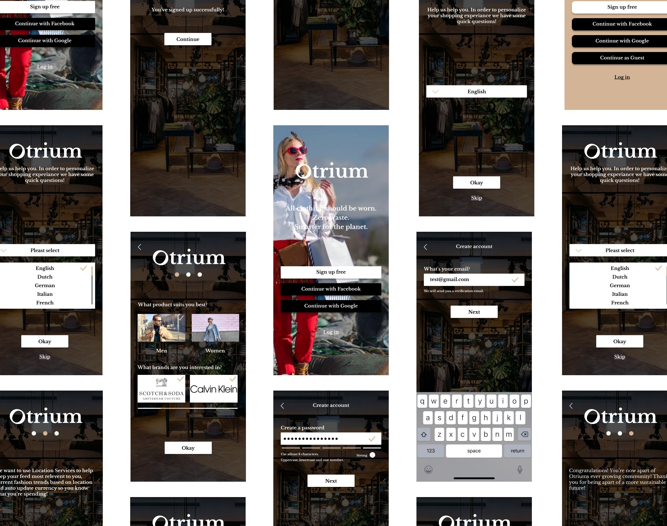
Redesigning parts of OTRIUMS platforms, to align with the brands mission statement meeting the expectations of its users.
0.1
overview
OTRIUM, is an online fashion outlet marketplace whose tech enables designer brands to turn unsold inventory into an opportunity. As part of Career Foundry’s UI specialization course, I chose to independently redesign a part of OTRIUMS existing web product. This gave me the freedom to further my skills as a UX/UI Designer.
objective
To independently UX/UI redesign parts of OTRIUMS platforms to further align with their mission statement.
challenge
role
MVP UI strategy, research, branding, visual branding & UI design
duration
November 2021 - April 2022
team
Individual
users objective
Users will be better able to view their sustainability options and clothing choices, understand how the system works and OTRIUMS values, and be able to have the app better understand the user while going through the process of signing up.
As consumers become more aware of ‘sustainable fashion’ and why it’s important, shopping has now become less about what’s cheap and more about what is eco-friendly. Now, consumers want to know if the brand is ethical, and what steps they are taking towards sustainability.
OTRIUM HAS THE RIGHT BONES, BUT THERE ARE AREAS OF IMPROVEMENT TO BECOME A MARKET LEADER.
tools
Figma, Sketch, Usability Hub, Word, Google Drive & pen & paper
0.2
research
competitive analysis
To be able to ideate design solutions I conducted background research, including a ‘competitor analysis’ to be able to take what OTRIUM is doing well and implement some of those elements in my designs.
0.3
define
ui audit
I conducted a ‘UI Audit’ of OTRIUMS main landing page and login to be able to find any possible problems. Due to time constraints, I found this was the most effective method to make design changes.
client interview
I spoke with OTRIUM about their core values and their already established user personas which gave me insight into how I might improve their existing website to communicate their mission statement and attract their core target audience.
0.4
ideate
Next steps involved sketching low - fidelity wireframes to conceptualise the redesign based on the persona given by OTRIUM. This is to give an idea of how it might look.
MID - FIDELITY_
After establishing key functions to be redesigned, I designed mid-fidelity wireframes with a fresh login screen and sign-up process. Ideating UI elements, design principles, responsive breakpoints, and grid layout. I looked at several user flows including login and personalisation.
MOODBOARD_
I came up with SHEEK, DARING, AND SUSTAINABLE for the MOODBOARD - users on OTRIUM are young, looking for a deal, but are also planet concious. I decided to use bright colors, clean typography, and clever imagery that is enviromentaly suggestive. The founders said, "ALL CLOTHING SHOULD BE WORN" I want the user to be aware of this, and it is why I moved ahead with this MOODBOARD.
STYLE GUIDE_
TYPOGRAPHY_ SOURCE SANS PRO
0.5_
RETROSPECT
WHAT WENT WELL?_
The execution of the redesign went well. I was to be able to speak with OTRIUM about their core values and already established persona which gave me insight into how I could communicate their mission statement.
WHAT DIDN'T GO WELL?_
The project had a mobile-first approach and due to time constraints, I was not able to focus as much time on desktop layouts. Also, software became an issue I used FIGMA throughout but I would've liked to have used other software for mockups or things that FIGMA can't do.
WHAT COULD BE BETTER?_
Desktop designs could've had some more focus, I only designed a few key screens for 2 different breakpoints. With the persona mainly using their website platform it would be useful to have these screens to conduct usability testing.
I want to continue building on this project, adding new screens, and focusing on desktop designs. I also want to see myself using different software like PHOTOSHOP or SKETCH to not limit myself in the future.


